
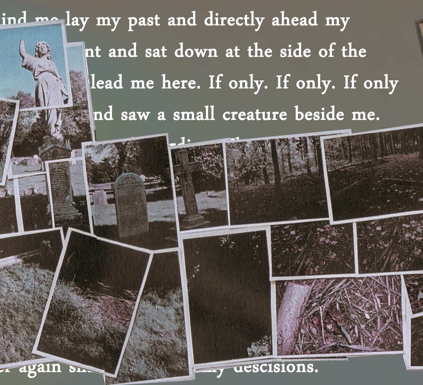
For the next three panels, i created a photomontage by taking images in a graveyard and a forest, both these places reflect the idea of a "path through life" which is a theme present in Pull/Pulk (revolving Doors). The photomontage looks like this:

The next stage was to put this montage onto our panels, this was easy enough as it fitted over three panels nicely. Behind the montage a wrote a short piece about walking along the path of life and stopping in fear of continuing down a bad road, the writing is deliberately hidden in places to keep some ambiguity and allow for our audience's interpretation. The middle panels ended up looking like this:


After this, I had to create the last panel which would contain the track listing for the album. I decided to use another image of trees to provoke the idea that trees are rooted to the ground, unlike people who are free to move in which ever direction they choose. After coming up with some other song titles relating to movement and inertia I put it together. The final panel looks like this:

The cover for our Digipak was subject to a lot of thought, we wanted to show movement and inertia through our image, yet they are contradicting things. Our first idea ended up as this:

I had other ideas despite creating this so in order to help us decide which would be the best cover to choose, we asked a group of twenty from our target audience (students our age with an interest in Radiohead)to pick their favourite design. From the twenty only seven chose the original design so we decided to go with our final design with a little tweaking to the colours due to people suggesting it would look good. Our final album cover shows irony in thew sense that shaun is clearly caught in movement yet the album is called Inertia i.e paralysed, i thought this was suitable as despite the movement the image is a still so it follows the idea of being caught in motion.