Wednesday 29 December 2010

The Editing Process - Adobe Premiere Pro

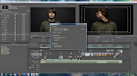
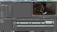
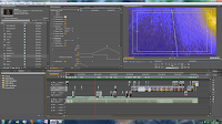
The editing process for Pull/Pulk (Revolving Doors) took some time due to the amount of clips we used and the heavy use of effects. We begun by importing the song and our clips into Adobe Premiere Pro. From there we constructed a basic cut of the video without effects or transitions, i wanted to make sure the timing for the clips was right before continueing with the edit. Here is some screenshots of this stage:

As you can see in screenshot one, we changed each clip's fps to 60 to better reflect the speed of the music. In screenshot two you can see the timeline with our footage all marked in place, on the left you can see a list of the clips we have imported.

After this we were able to maunally create the effects for the song such as editing the brightness/contrast/colour levels. I set up when the effects would come into the track and how each clip would progress to the next through transitions. We mainly used simple cuts and fades because other transitions seemed unnecessary for this kind of project. We overlayed different video files over one another and in some cases (such as the eye shot) resized the clip to fit into a certain area of the screen. Here are some screenshots of how we created the effects:
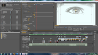
In screenshot one here you can see that we have resized the clip of the person moving their head to fit the eye, we have also heavily over-exposed the eye clip to make it white. Screenshot two shows how i have edited the lines for the effects to make them fade in and out at the right time.

Once the effects were sorted we rendered the video and exported it to Adobe Media Encoder to complete the editing process. Here is some screenshots showing the render/export stage:
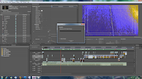
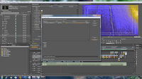
Here you can see in screenshot one the rendering of our movie, it takes all previously unrendered files and does it frame by frame for the best possible quality. Screenshot two shows the exporting process in Adobe Media Exporter, this converts our file to a viewable one and allows us to select the quality, size, region and frame-rate etc. of our video.

Monday 15 November 2010

Planning: Organisation of our Shoots.

I have compiled a list of actors, locations and props we want for our video to use as a reference when we are filming.

Actors

We will use ourselves in our production because we know what we want and by using ourselves we can avoid getting behind schedule due to actors being unavailable to shoot.

-Rob West (head turning shots/vocals)
-Shaun Rhodes (head turning shots/vocals/running shot)

However, we feel we should have someone else as well to give the video more variety.

-Jordan Kirby (head turning shots)

Locations

We have chosen various locations around town and school as possible places to shoot our video.

School
-Darkroom (For a controlled dark environment and black backdrop)
-Lift
-Trees and outdoors around the school

Around Town
-Cemetery (to draw parallels from our ancillary)
-Rob's house (For indoors scenes and close ups)
-Roads
-Archway by the church
-Trees and sky

Props

-A glass of milk
-Black and red ink
-Leaves
-Dictionary

Planning: List of possible shots for our Music Video.

Here is a list of possible shots we are considering to shoot for our video.

-People moving head (sped up)
- Stop motion of turning heads, parallels with ancillary tasks
-Ink in water
-Road markings (walking down the street
-Pan shot
- Streets, residential housing
-Sky and the sun
-Vocal shot
- Possibly under dark lighting to give eerie effect
-Archway and other doors
-Trees and natural environment
-Lift
-Doors (open/close)
-Buttons
- abstract angles within the lift.
-Graveyard, parallels with ancillary tasks
-Low angle shot of legs running
-Pan shot to dead end sign
-Eye ball close up (possibly over or under exposed)
- Dictionary definition of Inertia
-Cars in a traffic jam
- Traffic lights changing
- Crowds of people moving together

Saturday 13 November 2010

Creating our Digipak

In order to create our Digipak we used Photoshop Elements 8 editing software. I began by taking images of my group member Shaun with a show shutter speed to blur his head movement. The image i chose from this shoot is used in our album cover, edited using layering and blending techniques as well as saturation and blurring of the background to give it a 'colour burst' effect. I then found a font similar to fonts used by Radiohead in previous albums on a website called Dafont.com. With permission from the creator i used this font for the title and artist name on the cover. The final album cover looks like this:
For the next three panels, i created a photomontage by taking images in a graveyard and a forest, both these places reflect the idea of a "path through life" which is a theme present in Pull/Pulk (revolving Doors). The photomontage looks like this:

The next stage was to put this montage onto our panels, this was easy enough as it fitted over three panels nicely. Behind the montage a wrote a short piece about walking along the path of life and stopping in fear of continuing down a bad road, the writing is deliberately hidden in places to keep some ambiguity and allow for our audience's interpretation. The middle panels ended up looking like this:

After this, I had to create the last panel which would contain the track listing for the album. I decided to use another image of trees to provoke the idea that trees are rooted to the ground, unlike people who are free to move in which ever direction they choose. After coming up with some other song titles relating to movement and inertia I put it together. The final panel looks like this:


The cover for our Digipak was subject to a lot of thought, we wanted to show movement and inertia through our image, yet they are contradicting things. Our first idea ended up as this:

I had other ideas despite creating this so in order to help us decide which would be the best cover to choose, we asked a group of twenty from our target audience (students our age with an interest in Radiohead)to pick their favourite design. From the twenty only seven chose the original design so we decided to go with our final design with a little tweaking to the colours due to people suggesting it would look good. Our final album cover shows irony in thew sense that shaun is clearly caught in movement yet the album is called Inertia i.e paralysed, i thought this was suitable as despite the movement the image is a still so it follows the idea of being caught in motion.

Friday 12 November 2010

Planning for our own album cover. (first photoshoot)

This photograph was taken with a sutterspeed of 0.8 seconds and an aperture of f/22. This meant that as shaun was turning his head the camera captured a motion blur but was still able to get the detail of his face i.e his nose and mouth. I wanted to have a motion blur in the image in order to directly contradict our chosen album title 'Inertia' which means a lack of activity or movement. This is intentionally ironic because the album itself considers the idea of movement and the passage through life. The fact that his head is blurred suggests confusion which ties into our theme due to the idea that our paths in life are confusing and unpredictable.


These images are also from the cover photoshoot. I had shaun move his head around to cause the blur and try different facial expressions until we were happy with an image. The next step we are going to take with our chosen image is to use photoshop to edit it and create the cover.

Research: Radiohead - In Rainbows album panels


These are some of the album panels from Radiohead's most recent album, In Rainbows. Due to the title, they make use of a wide range of colours present in a rainbow. The art is abstract in true Radiohead style, the image of the left shows a foetus shape which holds connoations of birth and life. Also the space-like images make the audience feel like they are 'out of the world' which is representational of the music itself.

Research: Media Institutions for our product

Institutions play a fundamental role in the promotion and distribution of a media product. For our production we must consider institutions that will promote our video on television, our album advert in magazines, as well as companies who can produce and distribute the album itself.

One of the largest music promotion names in the business; Kerrang, would be an ideal institution for the promotion of our music video and digipak. The Bauer Media Group currently own the Kerrang Magazine which could promote sales of the album through our magazine advert. Kerrang is also a popular music TV channel owned by Box Television, this would be the perfect place to show our music video because it would be seen by an awful lot of people and is relevant to our target audience. We could also approach NME TV as a channel to play our video in order to appeal to a generally younger audience that may have not heard Radiohead before. The are many different magazines that could promote our album by using the advert, these magazines cover a wide variety of subjects and are read by a vast amount of people, music magazines such as Mojo, NME, Ultimate Guitar etc, game magazines such as OPM, Game, PC Gamer etc, as well as men's and women's magazines respectively. by pushing the advert to as many different magazines as possible we would be able to reach a far wider audience as well as appeal to new fans. However, not all magazines would be relevant to our album and so the audience that subscribes would probably not be interested; these are magazines like 'Horse and Hound' and kids magazines.

Capital Records have produced Radiohead music in the past and so they would be an ideal record company to produce and distribute this album. They are an international company which would greatly increase the amount of records sold as well as enable the album to be sold around the world.

Thursday 11 November 2010

Planning: Target Audience for our Music Video.

Our target audience for this project is focused on not only fans of Radiohead music (which spans many genres) but people who enjoy electronica music and experimental/abstract film-making. We plan to attract this audience by creating artistic shots within our video and using editing tools to manipulate our scenes for experimental purposes. This is a music video so our main audience will be watching it for the music as opposed to the visuals but we want to give them something worth watching on channels such as MTV. We understand that the music we are using is not exactly 'mainstream' but air time on music channels is important to promote the album as well as the band so we would push for as many plays as possible. We have also tried to attract our audience in our ancillary tasks by using experimental photographic techniques such as photomontage and photomanipulation.

Tuesday 12 October 2010

Research: Radiohead - Kid A album panels.


These are the album panels for the Radiohead Kid A. This album makes use of artwork by Thom Yorke and Stanley Donwood, the panels show mountainous terrain and small settlements which provokes ideas of isolation; one of the albums major themes. The band also incorporated tracing paper into the album sleeve to highlight the transparency of society. Everything in the album sleeve relates to the meanings and concepts in the songs but they are often subtle references or ideas that compliments the music.

Research: Radiohead - Amnesiac album panels.


This is the album sleeve panels from the Radiohead album Amnesiac. They are great examples of the kind of image Radiohead portray and their unique style. This particular album is a mix of artwork and writing. The track listing is on the back page of the booklet and is formatted in an interesting way.

Wednesday 29 September 2010

Research: Key features of the music video.

Music videos demonstrate genre characteristics, for example, stage performance and fast cuts in a metal video or a dance routine for a boy/girl band. A great example of a metal video is by a sheffield band, Bring me the Horizon. The video portrays a party scene with the band performing around a mosh. Fast cuts are used to emphasize the speed and intensity of the music.

There is a relationship between lyrics and visuals (either illustrative, amplifying, contradicting). Here is a video for the song Numb by Portishead, the video amplifies the lyrics by relating what is said to what is seen, for example, the line "I'm never so lost, I can't find my way" is complimented with shots of the lead singer wandering through a field, apparently lost. This video also illustrates the lyrics by showing Beth Gibbons (vocalist) singing along to the track.

It is also worth noting that when lyrics illustrate the visuals the video is usually story-based. In my opinion, the best example of a narrative music video that makes heavy use of the lyrics is the song Stan by Eminem.


There is a relationship between music and visuals (either illustrative, amplifying, contradicting). Here is a fan-made video for the song Rue the Whirl by the electronica duo Boards of Canada. This demonstrates how music can amplify the visuals, by timing the clips to change and shudder in time with the music. This involves the audience and doesn't aim to tell a story or show off the band, it just compliments the music for what it is. This is a similar idea to what i was considering for my music video of Pulk/Pull (Revolving Doors) by Radiohead.

I have also included in this post a music video for the electronica duo Autechre. I felt this was needed because this video was programmed specifically to the exact frequency of each sound present in the song and the visuals are representations of that data. It is an interesting concept to think about, being opposed to make a narrative or performance video, they instead take the viewer on a visual tour of their music.


The demands of the record label will include the need for lots of close-ups of the artist and the artist may develop motifs which recur across their work (a visual style). A perfect example of the record label requiring lots of close-ups on the artist is with La Roux. The video below was released when she was trying to promote herself into the mainstream, so it makes sense to give the viewers a good look at the singer so that they can familiarize themselves with her. Also her hairstyle has become a visual motif that makes her instantly recognizable, even to someone like me who does not claim to be a fan of her music.


These videos show various key features and conventions commonly in music videos, having an understanding of these features enables me to create a convincng music video for our particular genre and gives me insight into others in order to incorporate different styles and techniques into my work and therefore increasing my target audience and showing i have the ability to create something original within the context of the genre.

Research: Radiohead

Radiohead are an alternative rock band from England. They released their first single, 'Creep', in 1992. The song became an international hit after the release of their first album 'Pablo Honey' in 1993. Their popularity in the United Kingdom continued to rise with the release of their second album, 'The Bends' in 1995. The band's greatest achievement was to come in 1997 with the release of 'Ok Computer', their third studio album. Ok Computer thrust them into the international spotlight due to the album's intensity, expansive sound and themes of modern alienation. This album has gone on to be considered by the many as a landmark album of the 1990s.
The band took some time off following this success and did not produce another album together until 2000/2001 when 'Kid A' and 'Amnesiac' were released. These albums marked an evolution in Radiohead's musical style as they incorporated experimental electronic music. Thom Yorke has also said the lesser known genres such as Krautrock and post-punk were an influence when creating these alums. The Kid A/Amnesiac sessions are considered their greatest body of work to date by any fans. Next came the album 'Hail to the Thief' in 2003, which was a mix of guitar-driven rock, electronics and lyrics inspired by war. This was the last album for the band on the major record label, EMI. Radioheads first six albums combined had sold more that 25 million copies by 2007. This drove the band to independently release their seventh album, 'In Rainbows' in 2007, originally as a digital download which customers could set their own price. It was then released in physical form to critical and chart success.
Radiohead's work is known over the globe and has appeared in a huge amount of listener polls and critic lists. As of 2005, Radiohead were ranked number 73 in Rolling Stone magazine's "The Greatest Artists of All Time", personally I would have placed them higher due to the length of their musical scope. Although the band's early work was influential of British rock music, musicians in a wide variety of genres have been influenced by their later work, due to its experimental nature and accessibility.

The band consists of:

Thom Yorke (vocals, guitar, piano, beats)

Jonny Greenwood (guitars, keyboards, other instruments)


Ed O'Brien (guitars, backing vocals)


Colin Greenwood (bass, synthesizers)


Phil Selway (drums, percussion)


Radiohead are far from finished too, they are planning to release another album in 2011 which is exciting fans and critics alike.

Tuesday 28 September 2010

Research: Looking at Digipaks.


Digipak’s are designed to have the most available displaying space without the bulk; Digipak’s were first designed to be more economically friendly in production and after use than its predecessor the ABS and Acrylic case.

The standard digipak has 6 panels that can be easily displayed on, three on the inside and three on the outside. Atleast one of the inside panels must contain space for the disk, whether its an Acrylic disk fixing or a sleeve.


The Radiohead Album ‘In Rainbows’ was produced in a digipak format containing various items such as an album cover, album artwork, and other added extras. The disk comes in a separate card sleeve decorated with the artwork of the cover. This album is not the standard kind of digipak so when we come to creating our own album, we can look at various shapes and sizes of professional digipaks in order to help us make an informed and creative outcome.

Saturday 25 September 2010

Planning: Time Management

Time management for this project is important in order to keep up with the work load as well as making sure everything is prepared before we under go the production stage.

Pre-Production Schedule

18th October - complete both ancillary tasks, a Digipak for the album with four panels and a magazine advert for the promotion of the album.

19th November - Be fully prepared for the production, Storyboard complete and locations and shots thought out.

Production Schedule

23rd November - Begin outdoor filming

30th November - Begin indoor filming

10th December - Complete outstanding shots due to weather etc.

17th December - Complete filming stage of production.

Post-Production Schedule

20th December - Compile clips and audio in Adobe Premiere pro.

30th December - Complete editing of the video and render the file for export.

1st January - Make sure everything is complete up to the evaluation stage.

21st January - Complete evaluation of project and submit entire production.

This is a rough schedule for our project, hopefully we can stay on track but unforeseen issues may occur which means we cannot, for example, weather conditions, unavailable actors etc.


Friday 24 September 2010

Research: Pulk/Pull (Revolving Doors) lyrics and meaning.

-----------------------------------------------
There are barn doors

And there are revolving doors

Doors on the rudders of big ships
We are revolving doors

There are doors that open by themselves
There are sliding doors and there are secret doors

There are doors that lock and doors that don't

There are doors that let you in and out but never open

But they are trapdoors

That you can't come back from
-----------------------------------------------
Although the main focus of this song is the experimental sounds that shift and change, the lyrics themselves hold some meaning.
The sounds created put emphasis on the confusion of everyday life, how decisions and choices affect us, the revolving doors are a metaphor for the constant changes in direction and the feeling of spinning out of control. The point remains however, that all doors, no matter how daunting have an entrance and an exit, we just need to stop spinning and make a choice. The lyrics reflect this idea further with lines such as:

"There are barn doors"
This might suggest the bigger choices of your life

"Doors on the rudders of big ships"
The suggestion here is that there are very important decisions that you may have to make, to steer the direction of something big, such as a ship.

"We are revolving doors"
Yorke identifies the audience with the revolving confusion of life and talks about how we have to continue to make choice; continue to turn in our chosen direction.

"There are doors that open by themselves"
This could mean that some choices come naturally or are simply made for you by others.

"There are sliding doors and there are secret doors"
The idea that there are secret doors: hidden from the majority, possibly a shortcut or detour for our chosen path in life.

"There are doors that lock and doors that don't"
This seems to be referring to a decision that you make could be undone, but other times, that choice is final.

"There are doors that let you in and out but never open"
I think this is just a reference to an archway. This line has riddle-like qualities as an archway never opens, since it has no door, but it is a choice that we have to make nonetheless throughout life. Possibly a choice with no repercussions, something you can go back on at will.

"But they are trapdoors
That you can't come back from"
This haunting final line suggests how everyone makes bad choices at times, and can't turn back on them, no matter how much they wish they could.

Overall, the song lyrics are not meant to be thought about too deeply, the intention of this song is to experiment with various sounds and noises. However, there is some level of meaning that Thom Yorke wanted to get across and his lyrics help to do that despite them being hard to figure out when you listen to the song.

Research: The Artist of Radiohead's album covers


The image above shows Thom Yorke (lead vocalist) of Radiohead (left) and Dan Rickwood; pen name Stanley Donwood (right) hard at work perfecting a piece of Radiohead promotional art. The two met at Exeter university as art students, to date, Rickwood has created all the Radiohead related artwork since 1997 when he joined the band to design the 'Ok Computer' cover.

Dan Rickwood is not only an artist, he is also an author of several short stories as well as a talented graphic designer. His artwork has been displayed at various exhibitions around the world from Holland to Barcelona which has gained him much critical acclaim. We have included a link to his website (below).

http://www.slowlydownward.com/

In 2002, Rickwood and Yorke won a Grammy Award for Best Recording Package for the Special Edition for the album Amnesiac which has the song Pulk/pull (revolving doors). Donwood's writing has also been used in Radiohead album artwork, and frequently on Radiohead's official website. He is in essence a member of the band although he is no musician, the artwork he creates play a fundamental role in the band's overall image and promotion of their music.

Wednesday 15 September 2010

Research: Alternative music video.


This has been created and uploaded to youtube by a fan of Radiohead. We are including it in the blog because it explores various ideas for potential shots and sequences and gives us an insight into what would be required to pull off a music video for this song.

Research: Official Music Video by Radiohead.


This is the official video for the Radiohead songs Pulk/Pull (Revolving Doors) and Like Spinning Plates. Due to the length of the video it has not recieved much broadcast time on music channels such as MTV. Both songs are from the album Amnesiac and follow a similar pattern which is why they go together as one music video.

Sunday 12 September 2010

The Brief

A promotion package for the release of an album, to include a music promo video, together with two of the following three options:

A website homepage for the band

A cover for its release as part of a digipak (CD/DVD package)

A magazine advertisement for the digipak (CD/DVD package)


This is the brief for our music video production, we plan to create the digipak and magazine advert as our ancillary pieces.