Tuesday, 16 November 2010
Monday, 15 November 2010
Planning: Organisation of our Shoots.
I have compiled a list of actors, locations and props we want for our video to use as a reference when we are filming.
Actors
We will use ourselves in our production because we know what we want and by using ourselves we can avoid getting behind schedule due to actors being unavailable to shoot.
-Rob West (head turning shots/vocals)
-Shaun Rhodes (head turning shots/vocals/running shot)
However, we feel we should have someone else as well to give the video more variety.
-Jordan Kirby (head turning shots)
Locations
We have chosen various locations around town and school as possible places to shoot our video.
School
-Darkroom (For a controlled dark environment and black backdrop)
-Lift
-Trees and outdoors around the school
Around Town
-Cemetery (to draw parallels from our ancillary)
-Rob's house (For indoors scenes and close ups)
-Roads
-Archway by the church
-Trees and sky
Props
-A glass of milk
-Black and red ink
-Leaves
-Dictionary
Planning: List of possible shots for our Music Video.
Here is a list of possible shots we are considering to shoot for our video.
-People moving head (sped up)
- Stop motion of turning heads, parallels with ancillary tasks
-Ink in water
-Road markings (walking down the street
-Pan shot
- Streets, residential housing
-Sky and the sun
-Vocal shot
- Possibly under dark lighting to give eerie effect
-Archway and other doors
-Trees and natural environment
-Lift
-Doors (open/close)
-Buttons
- abstract angles within the lift.
-Graveyard, parallels with ancillary tasks
-Low angle shot of legs running
-Pan shot to dead end sign
-Eye ball close up (possibly over or under exposed)
- Dictionary definition of Inertia
-Cars in a traffic jam
- Traffic lights changing
- Crowds of people moving together
Saturday, 13 November 2010
Creating our Digipak
In order to create our Digipak we used Photoshop Elements 8 editing software. I began by taking images of my group member Shaun with a show shutter speed to blur his head movement. The image i chose from this shoot is used in our album cover, edited using layering and blending techniques as well as saturation and blurring of the background to give it a 'colour burst' effect. I then found a font similar to fonts used by Radiohead in previous albums on a website called Dafont.com. With permission from the creator i used this font for the title and artist name on the cover. The final album cover looks like this:
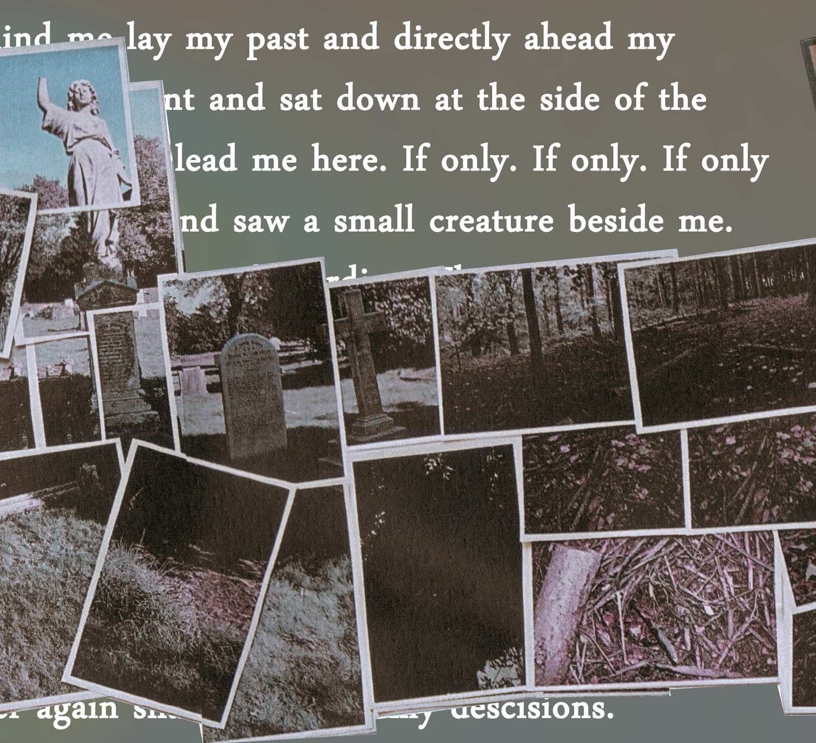
For the next three panels, i created a photomontage by taking images in a graveyard and a forest, both these places reflect the idea of a "path through life" which is a theme present in Pull/Pulk (revolving Doors). The photomontage looks like this:

The next stage was to put this montage onto our panels, this was easy enough as it fitted over three panels nicely. Behind the montage a wrote a short piece about walking along the path of life and stopping in fear of continuing down a bad road, the writing is deliberately hidden in places to keep some ambiguity and allow for our audience's interpretation. The middle panels ended up looking like this:


After this, I had to create the last panel which would contain the track listing for the album. I decided to use another image of trees to provoke the idea that trees are rooted to the ground, unlike people who are free to move in which ever direction they choose. After coming up with some other song titles relating to movement and inertia I put it together. The final panel looks like this:

The cover for our Digipak was subject to a lot of thought, we wanted to show movement and inertia through our image, yet they are contradicting things. Our first idea ended up as this:

I had other ideas despite creating this so in order to help us decide which would be the best cover to choose, we asked a group of twenty from our target audience (students our age with an interest in Radiohead)to pick their favourite design. From the twenty only seven chose the original design so we decided to go with our final design with a little tweaking to the colours due to people suggesting it would look good. Our final album cover shows irony in thew sense that shaun is clearly caught in movement yet the album is called Inertia i.e paralysed, i thought this was suitable as despite the movement the image is a still so it follows the idea of being caught in motion.
Friday, 12 November 2010
Planning for our own album cover. (first photoshoot)
 This photograph was taken with a sutterspeed of 0.8 seconds and an aperture of f/22. This meant that as shaun was turning his head the camera captured a motion blur but was still able to get the detail of his face i.e his nose and mouth. I wanted to have a motion blur in the image in order to directly contradict our chosen album title 'Inertia' which means a lack of activity or movement. This is intentionally ironic because the album itself considers the idea of movement and the passage through life. The fact that his head is blurred suggests confusion which ties into our theme due to the idea that our paths in life are confusing and unpredictable.


These images are also from the cover photoshoot. I had shaun move his head around to cause the blur and try different facial expressions until we were happy with an image. The next step we are going to take with our chosen image is to use photoshop to edit it and create the cover.
Research: Radiohead - In Rainbows album panels


These are some of the album panels from Radiohead's most recent album, In Rainbows. Due to the title, they make use of a wide range of colours present in a rainbow. The art is abstract in true Radiohead style, the image of the left shows a foetus shape which holds connoations of birth and life. Also the space-like images make the audience feel like they are 'out of the world' which is representational of the music itself.
Research: Media Institutions for our product
Institutions play a fundamental role in the promotion and distribution of a media product. For our production we must consider institutions that will promote our video on television, our album advert in magazines, as well as companies who can produce and distribute the album itself.
One of the largest music promotion names in the business; Kerrang, would be an ideal institution for the promotion of our music video and digipak. The Bauer Media Group currently own the Kerrang Magazine which could promote sales of the album through our magazine advert. Kerrang is also a popular music TV channel owned by Box Television, this would be the perfect place to show our music video because it would be seen by an awful lot of people and is relevant to our target audience. We could also approach NME TV as a channel to play our video in order to appeal to a generally younger audience that may have not heard Radiohead before. The are many different magazines that could promote our album by using the advert, these magazines cover a wide variety of subjects and are read by a vast amount of people, music magazines such as Mojo, NME, Ultimate Guitar etc, game magazines such as OPM, Game, PC Gamer etc, as well as men's and women's magazines respectively. by pushing the advert to as many different magazines as possible we would be able to reach a far wider audience as well as appeal to new fans. However, not all magazines would be relevant to our album and so the audience that subscribes would probably not be interested; these are magazines like 'Horse and Hound' and kids magazines.
Capital Records have produced Radiohead music in the past and so they would be an ideal record company to produce and distribute this album. They are an international company which would greatly increase the amount of records sold as well as enable the album to be sold around the world.
Thursday, 11 November 2010
Planning: Target Audience for our Music Video.
Our target audience for this project is focused on not only fans of Radiohead music (which spans many genres) but people who enjoy electronica music and experimental/abstract film-making. We plan to attract this audience by creating artistic shots within our video and using editing tools to manipulate our scenes for experimental purposes. This is a music video so our main audience will be watching it for the music as opposed to the visuals but we want to give them something worth watching on channels such as MTV. We understand that the music we are using is not exactly 'mainstream' but air time on music channels is important to promote the album as well as the band so we would push for as many plays as possible. We have also tried to attract our audience in our ancillary tasks by using experimental photographic techniques such as photomontage and photomanipulation.
Subscribe to:
Posts (Atom)