Pull/ Pulk (Revolving Doors) Radiohead
The brief for this project was to produce a promotional package including two of the three given choices as well as a music video for an existing track. The options were;
1. a website homepage for the band.
2. a cover for its release as part of a digipak (CD/DVD package)
3. a magazine advertisement for the digipak (CD/DVD package)
As a group we decided to produce elements 2 and 3, this was because we felt that designing and implementing a webpage would be risky as it doesn’t play into any of our strong points.
Explanation of the Products
At the start of the project, after choosing to do a music video and promotional package, we had to decide on an artist or band. This research into music involved listening to a lot of music inside and out of lesson to find the perfect track for us, we wanted a song that we could incorporate all elements of a typical music
video, but retain our creative freedom.
Digipak
The digipak is a five-panel document that is used to display both information about the artist and promotional and artistic images and text. We split our five pages up into different style sections. Panel one (left to right) is pure eye catching display, it contains a burst of colour from the centre, above the main feature of the image is the Artist name and Album title in Block Bold white ‘Radiohead style’ text.
Promotional Poster
The Promotional poster is used to draw attention and provide information about the style and genre of the artist and some general information about the album. I feel that our poster covers all the bases as it contains all the key features described. The style of the poster fits into the overall themes well and is clearly recognisable. We chose to depict an image of the statue as it shows a sense of stillness relating to the title ‘Inertia’. The statue also could be representational of death this is contrasted by the background of the wood representing life.
Music Video
The typical music video is purely for promoting the track and artist; we included elements of typical videos such as layering in some vocals over the top of the clips. Other elements we included were editing to the beat in places throughout, this trick makes the audio and visuals feel more linked. I think we managed to produce a wide variety of different camera shots to gave different feels, an example of a less typical music video shot is the Lift Buttons clip (1:51-1:56). I like this shot as it suits the slower ‘muzak’ style section of the track. I also like the ‘watching’ shot (3:20-3:42), this shot was converted to a ‘Vector High Contrast’ in the editing stages then the addition of the layered clip under the eye was added.
Use, Develop or Challenge Forms and Conventions?
The Forms and Conventions for a typical music video would include;
• Genre Characteristics (E.g. Live Stage Footage for metal / rock genre or dance routine for boy/girl group)
• Relationship between lyrics and visuals.
• Close-up of artist for promotional purposes
• Voyeuristic treatment of the female body.
Radiohead’s style is to differ from most other videos by not complying with most if not all of these ‘guidelines’ to a music video. We also wanted to challenge the conventions to remain in the style of Radiohead, we wanted to make a more conceptual based video that made the audience think and draw their own views of what was shown. A good example of this is the tree that is circled in the cemetery, one view brought up in the feedback was that it was a burst of life from earth surrounded by death. Whilst others saw it as a dead tree that resembled the essence of the cemetery. But we did try to add some firm-set representations such as the road tracking shots resembling a journey that that the audience is being taken on. As well as the final shot of the road sign (dead end) coupled with the fade to white representing the ascension away from life.
Effective Combination of Main and Ancillary texts?
Making the ancillary and main tasks in the same theme produces a media style; this media style is more powerful to the audience as it is the first impression to new customers. We wanted to match in the promotional poster and digipak to the video; we achieved this by adding similar images and representations. An example of this could be the first panel of the digipak, the full page image is recognisable to the music video’s head tuning shots. This image was produced by setting the exposure rate up to around 3-4 seconds; this creates the blur and distortion of the head. Along with this camera trick, the image was heavily edited. In the audience feedback we asked the question ‘looking at the album cover, promotional poster and music video, would you say that uniformity is present throughout?’ all four said that uniformity could be recognised in the three elements of the project. One went on to say that they could also recognise themes that Radiohead currently use in their work and could see this as being one of their own.
Audience feedback.
For audience feedback we needed a group which has had some media background, fans of Radiohead and generally open minded out looking. I chose to recruit a media educated friend Jamie, his girlfriend Laura, an open minded philosopher friend Ryan and general Music fan Harry. The questions put to the audience for feedback were as follows;
• Does the video reflect the song and artists style?
Most of the feedback group replied positively to this questions exept one, they did not know of Radiohead’s style so couldn’t comment.
• Did the video give you the impression of a professional overall finish?
All of the Audience group gave read feedback here. “Better than some of today’s music video’s” said Music fan Harry
• What would you say the strengths of the video are?
We had many different replies from the group including “more depth and things to think about than other music video’s” said Deep thinker Ryan
• What would you say the weaknesses of the video are?
One thing that kept cropping up was the issue that the lyrics are not clear enough to be readable and the clips shown should be more direct in explaining.
• Looking at the album cover, promotional poster and music video, would you say that uniformity is present throughout?
As mentioned before everyone was very positive in their responses one even said that they could picture this as one of Radiohead’s own work.
New media technologies used in the Construction, Research, Planning and Evaluation stages?
In the planning stages we decided that we would produce both our ancillary and main tasks outside of school, this offered both advantages and disadvantages. One downside to working outside school is the importance of organisation of spare time, time outside of school needs to be discussed with group members and meeting dates set. As well as this, teachers are more distanced from the work making continuous support and guidance is reduced. Although, this distancing from the teacher gives us more of a chance to express our creative freedom. Positive elements of home working are the freedom to use any software in the editing stage of both ancillary and main tasks. As well as this web access is not restricted by school servers so better quality research is gathered.
With the new software came the need to learn new editing skills and learning our way through the program and its features. One thing we found was that if we looked at the editing software before we planned the camera shots, we could see what tools we had to work with, giving us a better understanding of what camera tricks we could use to make it look better.
We decided to move away from the media departments standard camera’s to film our video as we wanted to give a High Quality, professional finish. We chose to take advantage of Robs photography camera and film it all on that. His camera can film High Definition clips that would be perfect for the job. Of course going down this path meant that rob could teach me new skills including setting up the camera, manually focusing and taught me how to utilise explosion rates for aesthetic effect.
Through the planning stages we decided to display it all on a blog (blogger.com), this allowed us to present our work progressively in many different formats such as large images (storyboard), text documents (researching) and embedded YouTube video’s. This interactive platform allowed us to add documents either in school or at home. Also insures that work wouldn’t be lost as it is all stored online.
Year 13 Media Production
Friday, 6 May 2011
Friday, 21 January 2011
Thursday, 6 January 2011
Audience Feedback
We have made a questionnaire for selected members of our target audience to answer in order for us to get feedback on our project. The questions we will ask them are as follows:
- Does the video reflect the song and artists themes?
- Did the video give the impression of a professional finish?
- What would you say the strengths of the video are?
- What would you say the weaknesses of the video are?
- Looking at the album cover, promotional poster and music video, would you say that uniformity is present throughout?
Hopefully we shall receive positive feedback as well constructive criticism we can use when we evaluate our work.
Our Music Video.
This is our final cut from the production of Pull/Pulk (Revolving Doors) music video. Due to it being a youtube upload this version is not the best quality.
Wednesday, 29 December 2010
The Editing Process - Adobe Premiere Pro
The editing process for Pull/Pulk (Revolving Doors) took some time due to the amount of clips we used and the heavy use of effects. We begun by importing the song and our clips into Adobe Premiere Pro. From there we constructed a basic cut of the video without effects or transitions, i wanted to make sure the timing for the clips was right before continueing with the edit. Here is some screenshots of this stage:
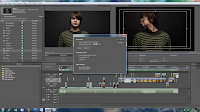
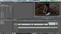
As you can see in screenshot one, we changed each clip's fps to 60 to better reflect the speed of the music. In screenshot two you can see the timeline with our footage all marked in place, on the left you can see a list of the clips we have imported.
After this we were able to maunally create the effects for the song such as editing the brightness/contrast/colour levels. I set up when the effects would come into the track and how each clip would progress to the next through transitions. We mainly used simple cuts and fades because other transitions seemed unnecessary for this kind of project. We overlayed different video files over one another and in some cases (such as the eye shot) resized the clip to fit into a certain area of the screen. Here are some screenshots of how we created the effects:
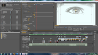
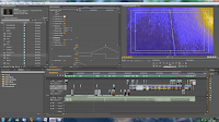
In screenshot one here you can see that we have resized the clip of the person moving their head to fit the eye, we have also heavily over-exposed the eye clip to make it white. Screenshot two shows how i have edited the lines for the effects to make them fade in and out at the right time.
Once the effects were sorted we rendered the video and exported it to Adobe Media Encoder to complete the editing process. Here is some screenshots showing the render/export stage:
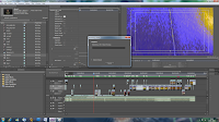
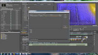
Here you can see in screenshot one the rendering of our movie, it takes all previously unrendered files and does it frame by frame for the best possible quality. Screenshot two shows the exporting process in Adobe Media Exporter, this converts our file to a viewable one and allows us to select the quality, size, region and frame-rate etc. of our video.


As you can see in screenshot one, we changed each clip's fps to 60 to better reflect the speed of the music. In screenshot two you can see the timeline with our footage all marked in place, on the left you can see a list of the clips we have imported.
After this we were able to maunally create the effects for the song such as editing the brightness/contrast/colour levels. I set up when the effects would come into the track and how each clip would progress to the next through transitions. We mainly used simple cuts and fades because other transitions seemed unnecessary for this kind of project. We overlayed different video files over one another and in some cases (such as the eye shot) resized the clip to fit into a certain area of the screen. Here are some screenshots of how we created the effects:


In screenshot one here you can see that we have resized the clip of the person moving their head to fit the eye, we have also heavily over-exposed the eye clip to make it white. Screenshot two shows how i have edited the lines for the effects to make them fade in and out at the right time.
Once the effects were sorted we rendered the video and exported it to Adobe Media Encoder to complete the editing process. Here is some screenshots showing the render/export stage:


Here you can see in screenshot one the rendering of our movie, it takes all previously unrendered files and does it frame by frame for the best possible quality. Screenshot two shows the exporting process in Adobe Media Exporter, this converts our file to a viewable one and allows us to select the quality, size, region and frame-rate etc. of our video.
Tuesday, 16 November 2010
Monday, 15 November 2010
Planning: Organisation of our Shoots.
I have compiled a list of actors, locations and props we want for our video to use as a reference when we are filming.
Actors
We will use ourselves in our production because we know what we want and by using ourselves we can avoid getting behind schedule due to actors being unavailable to shoot.
-Rob West (head turning shots/vocals)
-Shaun Rhodes (head turning shots/vocals/running shot)
However, we feel we should have someone else as well to give the video more variety.
-Jordan Kirby (head turning shots)
Locations
We have chosen various locations around town and school as possible places to shoot our video.
School
-Darkroom (For a controlled dark environment and black backdrop)
-Lift
-Trees and outdoors around the school
Around Town
-Cemetery (to draw parallels from our ancillary)
-Rob's house (For indoors scenes and close ups)
-Roads
-Archway by the church
-Trees and sky
Props
-A glass of milk
-Black and red ink
-Leaves
-Dictionary
Subscribe to:
Comments (Atom)